Bold Monday | Oskar – A timeless homage to the early 20th century
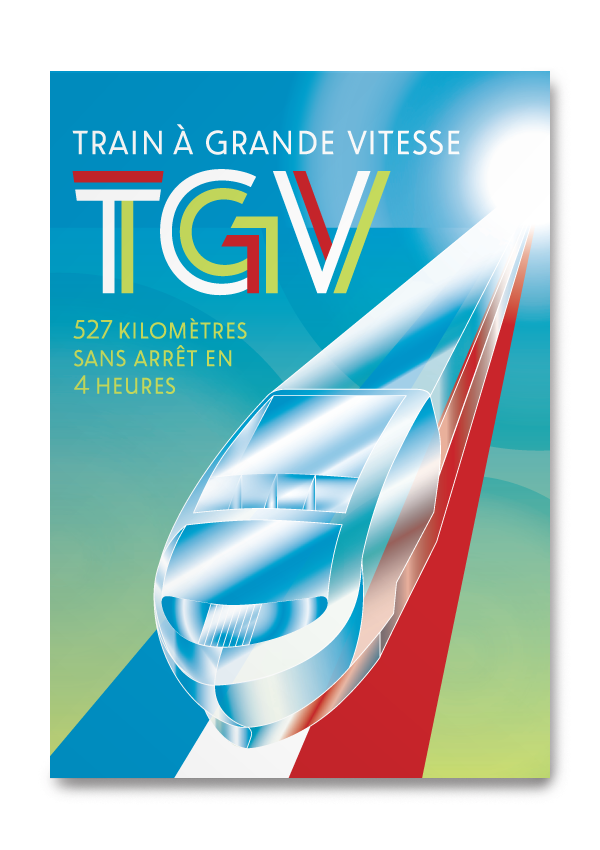
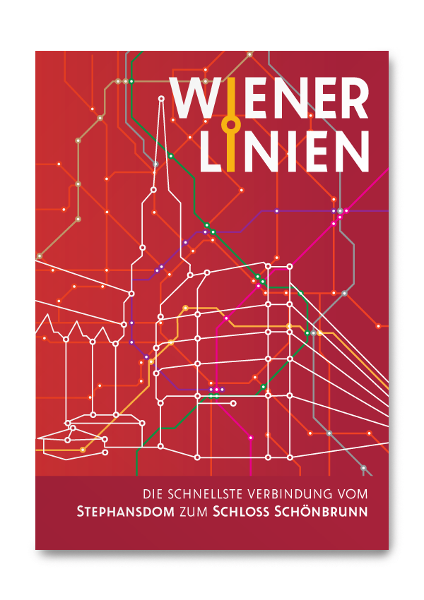
Bold Monday, a type foundry based in The Hague, the Netherlands, released a new wonderful font family called Oskar, designed by Paul van der Laan. As for one of their earlier releases – Macula – I was asked to create some examples of the font in use. Again a fantastic opportunity to express my great esteem for a good looking well-made font, in combination with different illustration styles depending on the subject. The following posters are completely fictitious.
Oskar comes in two stylistically different versions and three weights. For each version an inline style was added. This makes it really special and gives the possibility to a great variety. Initially drawn for lettering, the following examples show that the font has become a fabulous headline font with a clear link to its origin and without loosing its modernity.


The complete font family or single styles can be ordered at http://www.boldmonday.com/en/oskar/


